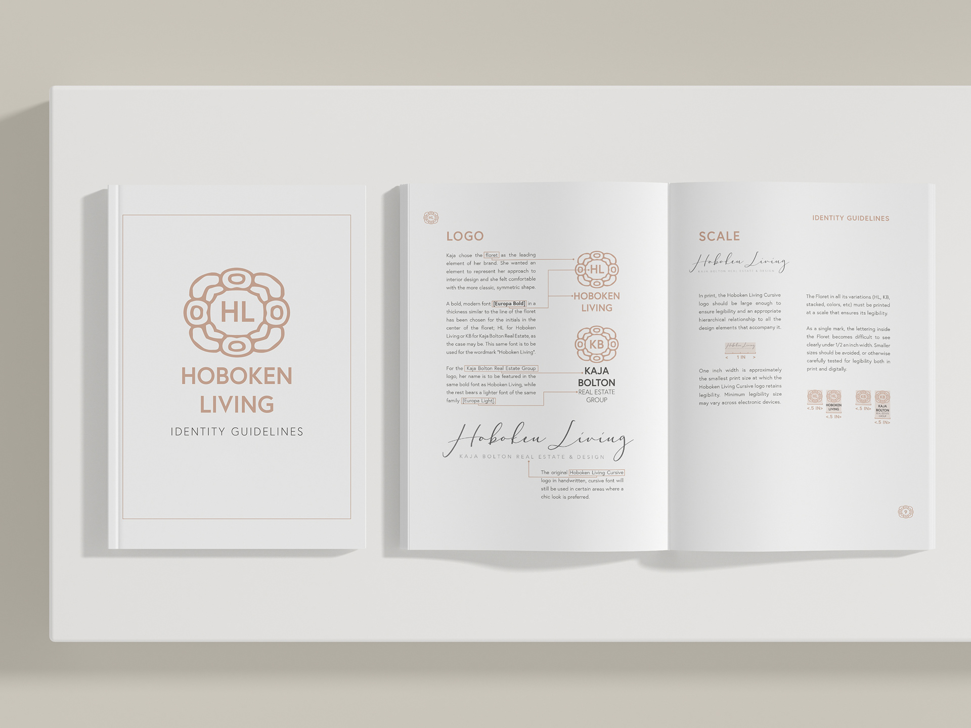
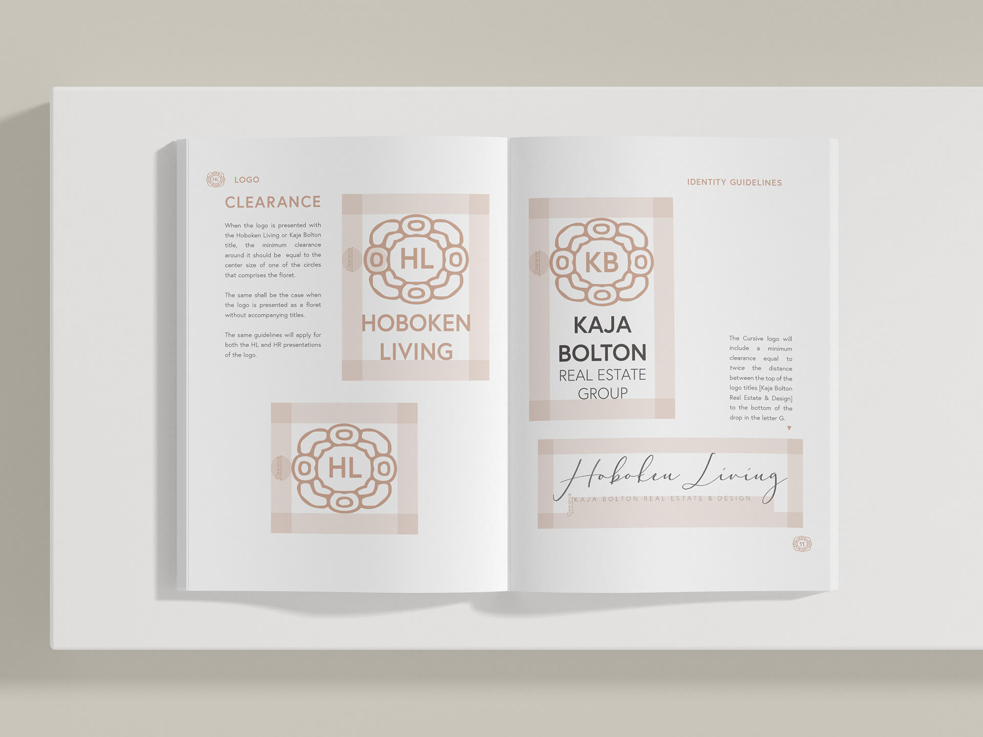
Identity Guidelines: Logo
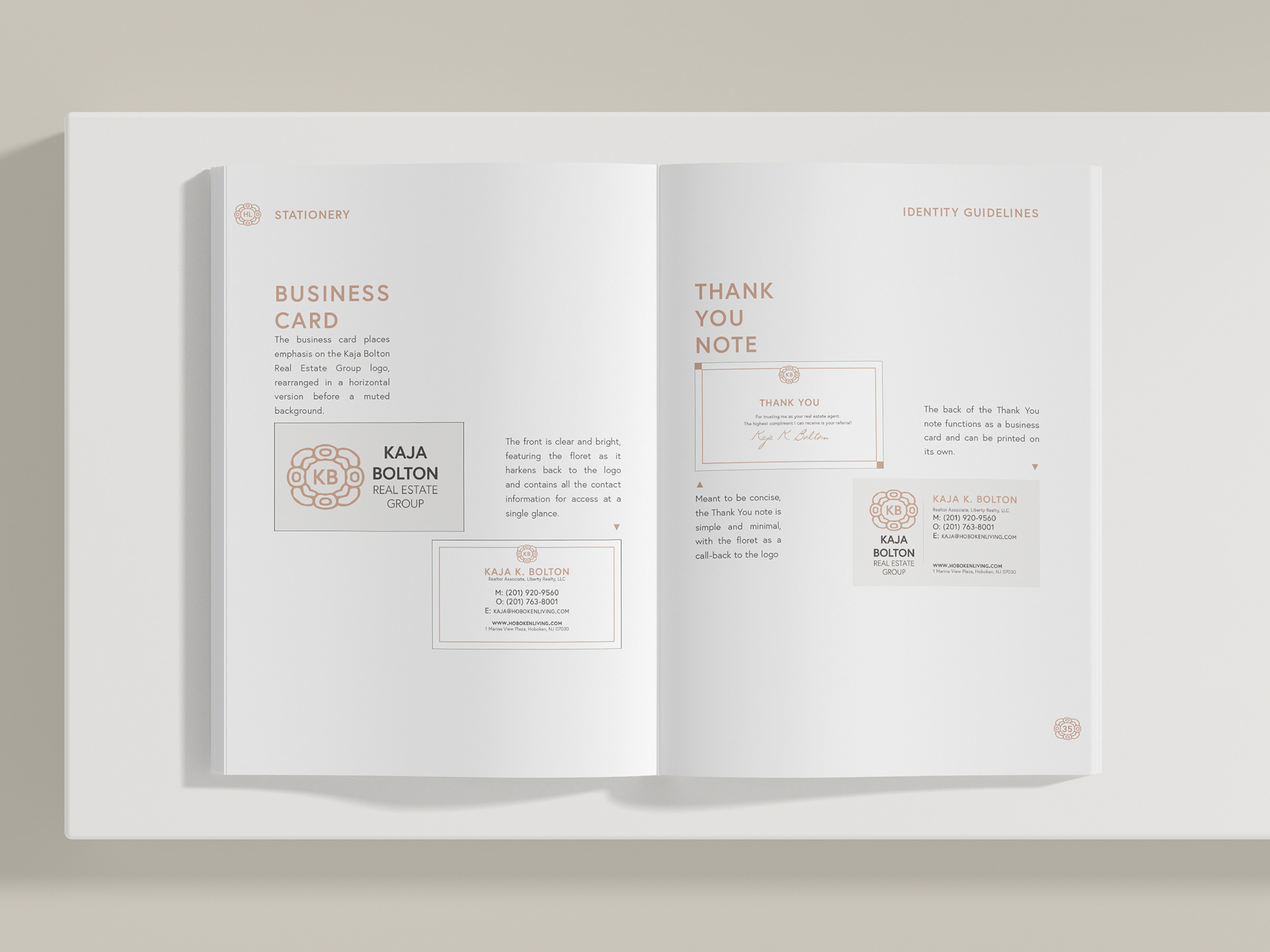
Identity Guidelines: Stationery
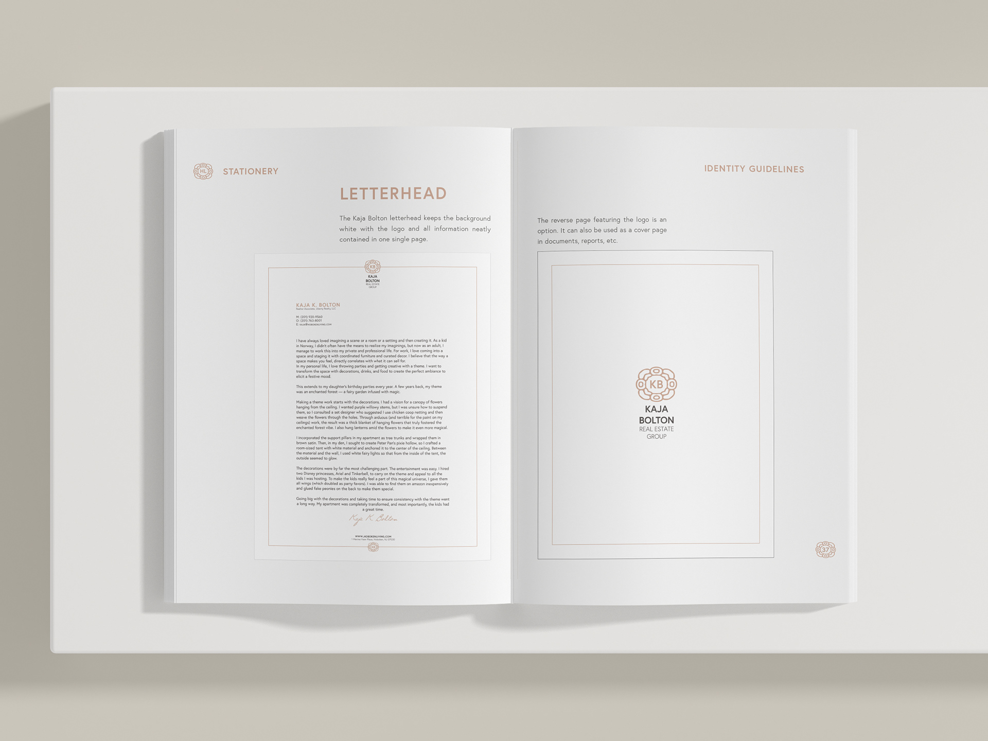
Identity Guidelines: Letterhead
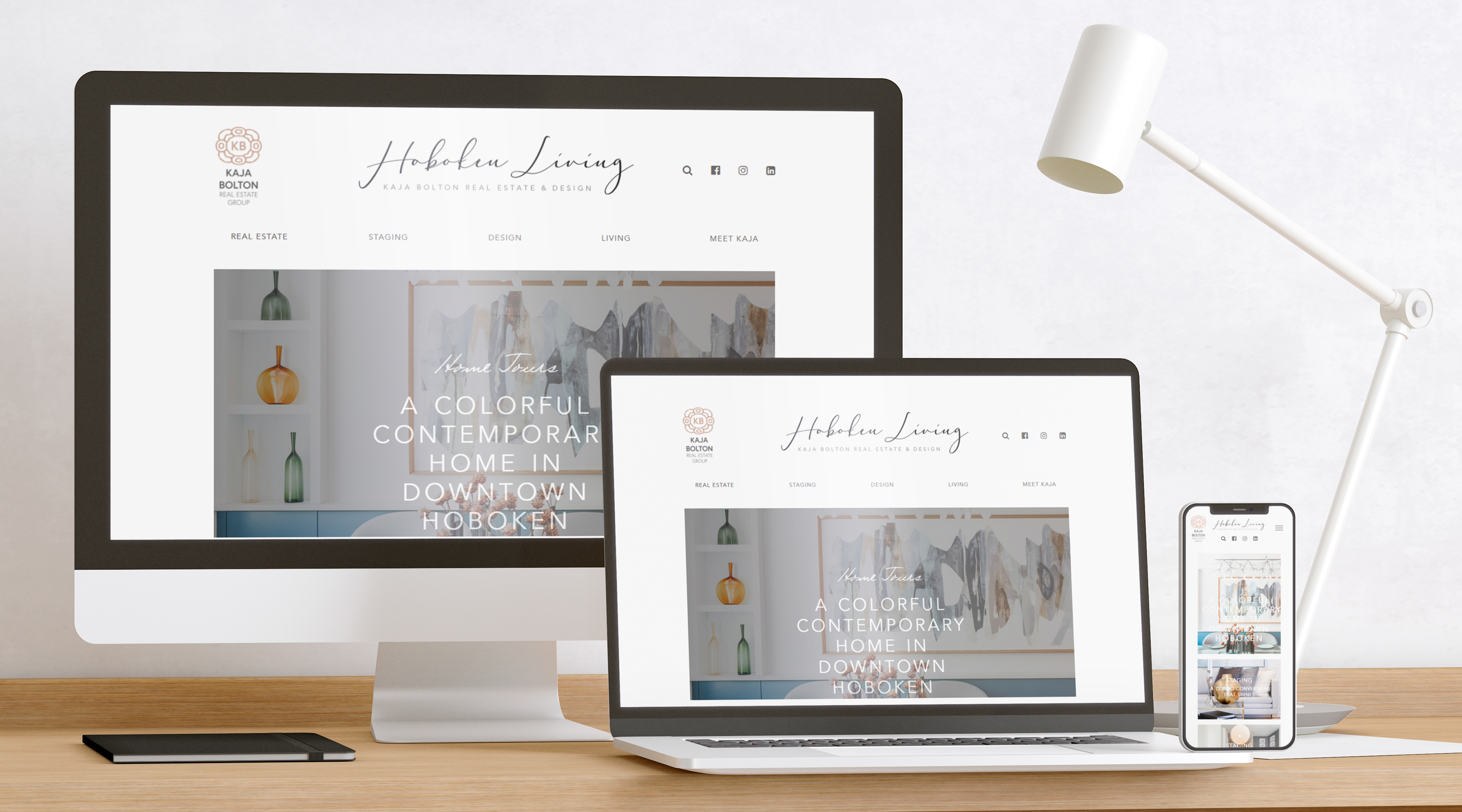
Hoboken Living Cross-Device

Printed Materials (Front)
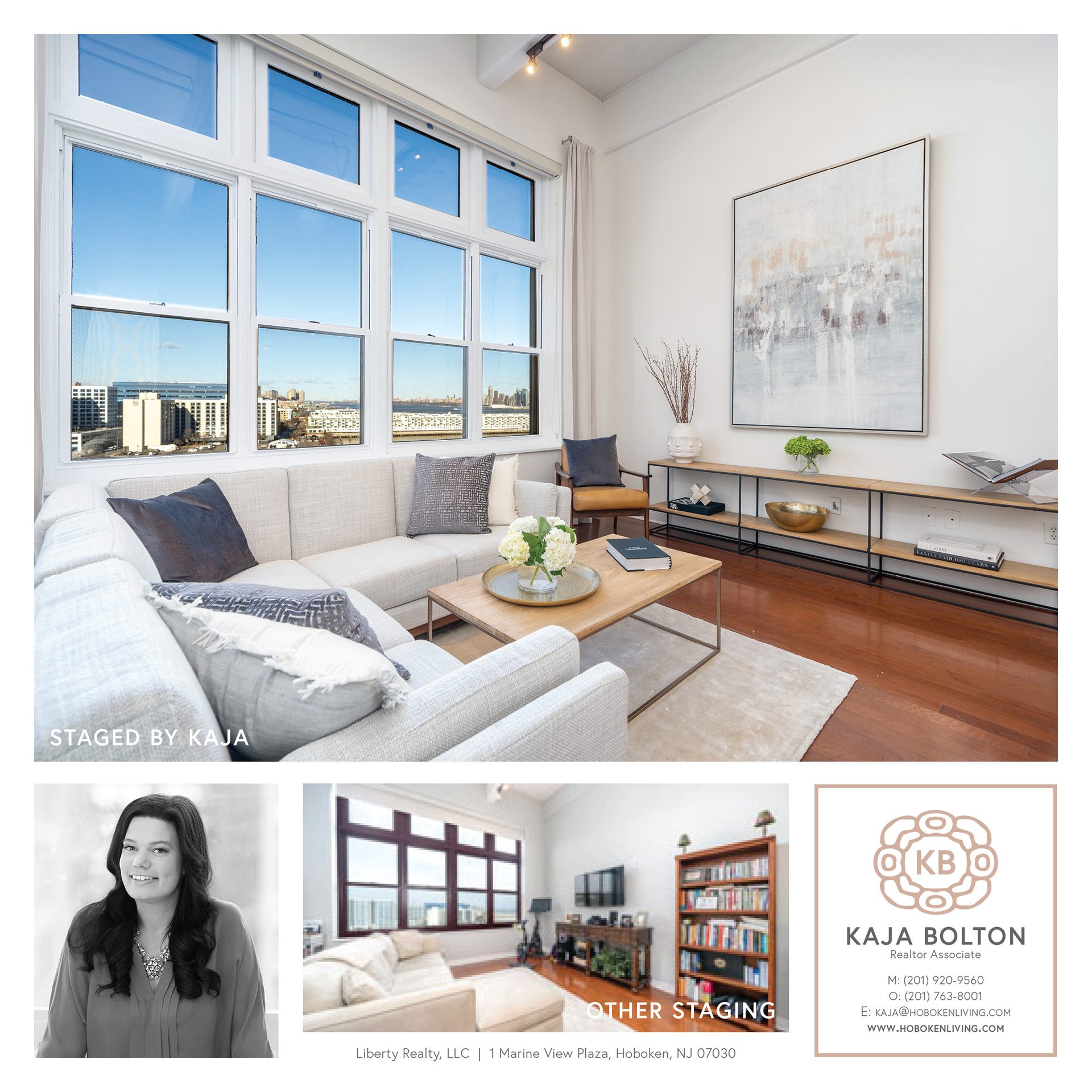
Printed Materials (Back)
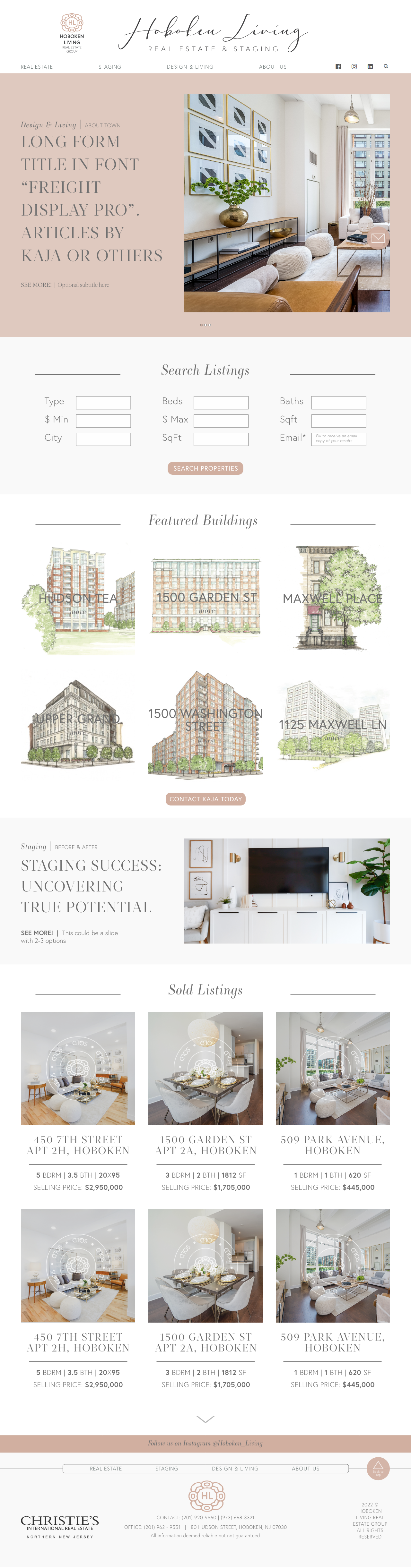
Real Estate Site UI Prototype
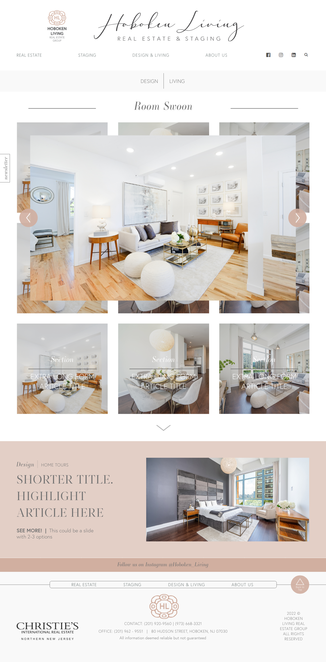
Room Swoon Page UI Prototype
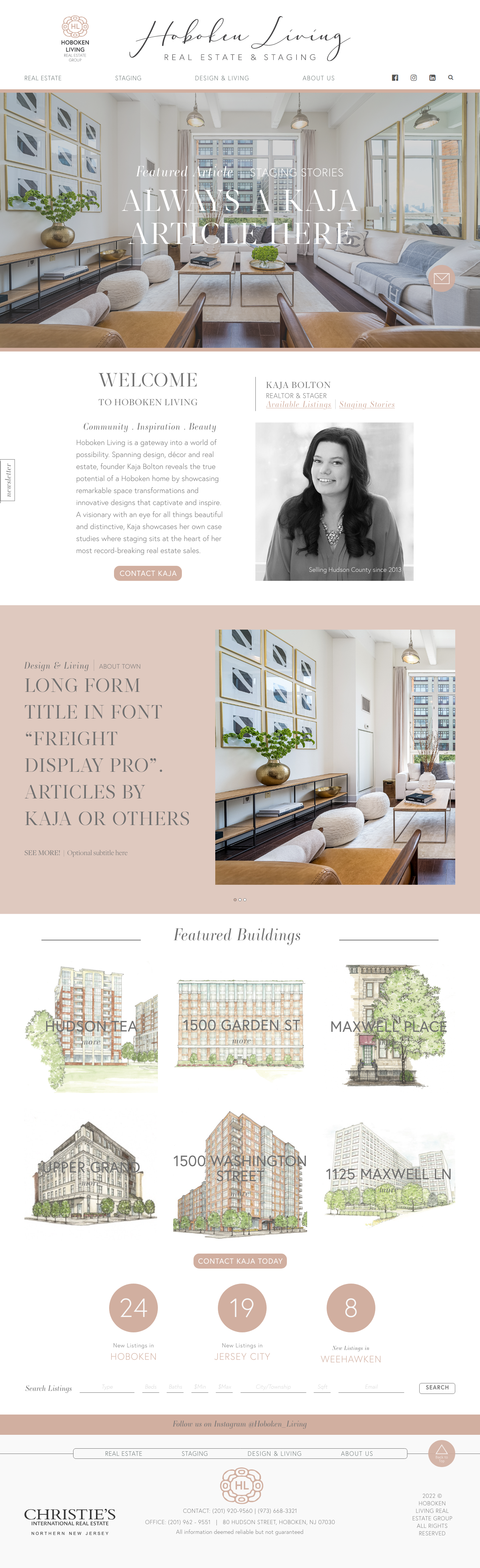
Blog Homepage UI Prototype
HOBOKEN LIVING
& KAJA BOLTON REAL ESTATE GROUP
The Hoboken Living blog covers interior design and lifestyle trends for Hoboken residents. Additionally, it serves as a platform to showcase Kaja Bolton’s real estate and staging endeavors. Her personal brand is built around the concept of luxury living, positioning Kaja as a tastemaker and a knowledgeable real estate agent.
The original bubblegum-pink floret in papyrus font didn’t convey a sense of luxury or sophistication, however the floret and cursive Hoboken Living logo were required components. The Hoboken Living and Kaja Bolton REG logos, once entirely different, were unified through the the floret, creating a recognizable identity as twin brands. The new design incorporates modern fonts and an elegant color palette, supported by a visual system and identity guidelines to maintain brand cohesiveness.
UI prototypes were developed for the website redesign, as it evolves into the Hoboken Living Real Estate Group brand.